
- Joined
- 24 February 2019
- Messages
- 51,076
- Reactions Received
- 72,505
- Location
- Ahsoka’s Heart 💜
- Cards
- View Profile
- KS Coins
- 147,385
- Fandom
- ProfessorAthena
- Gender
- Female
- Pronouns
- She/her
- Ship
- Wreck


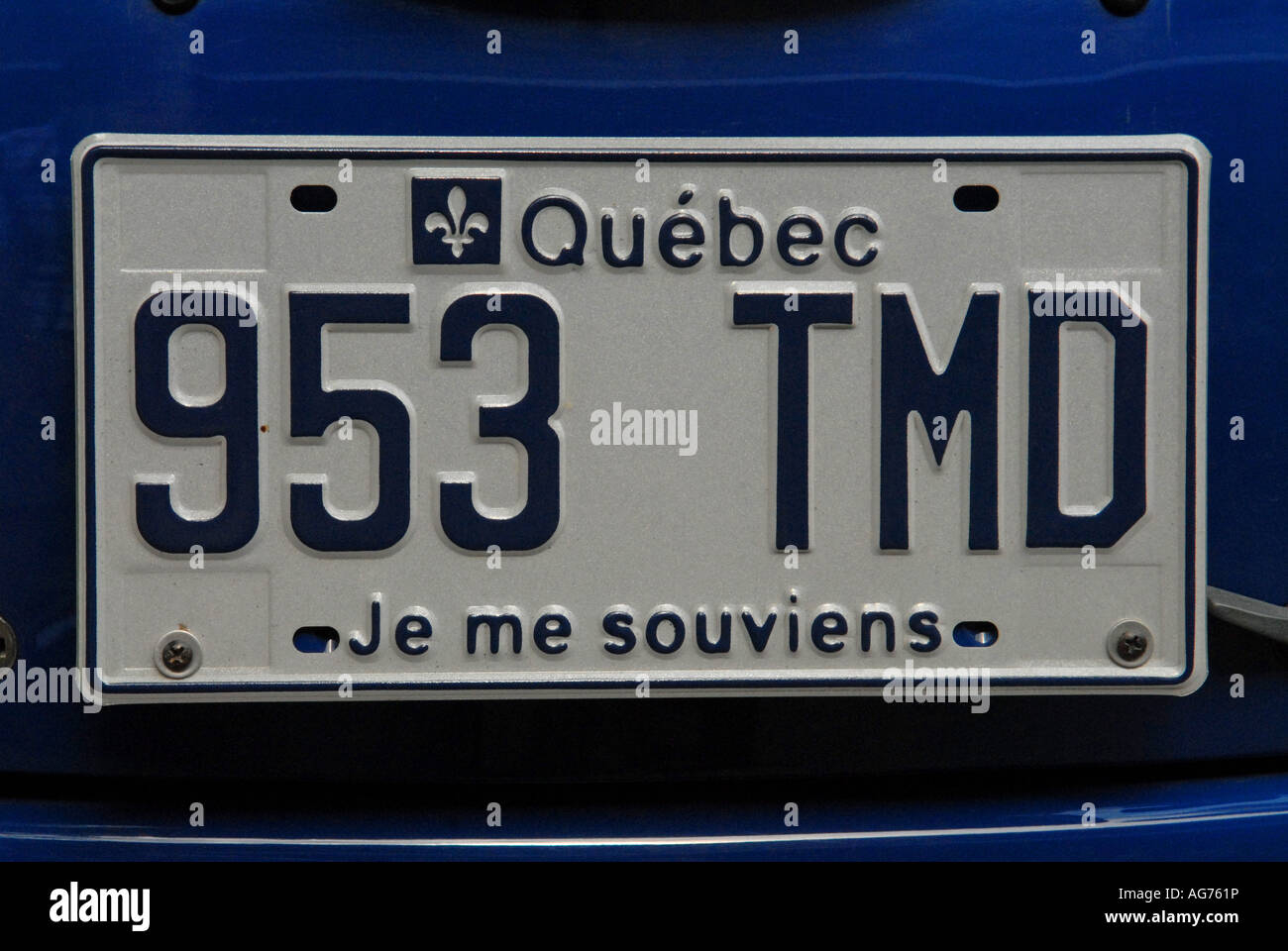
13. Quebec
The font is the same for everything and the colour is so bland.
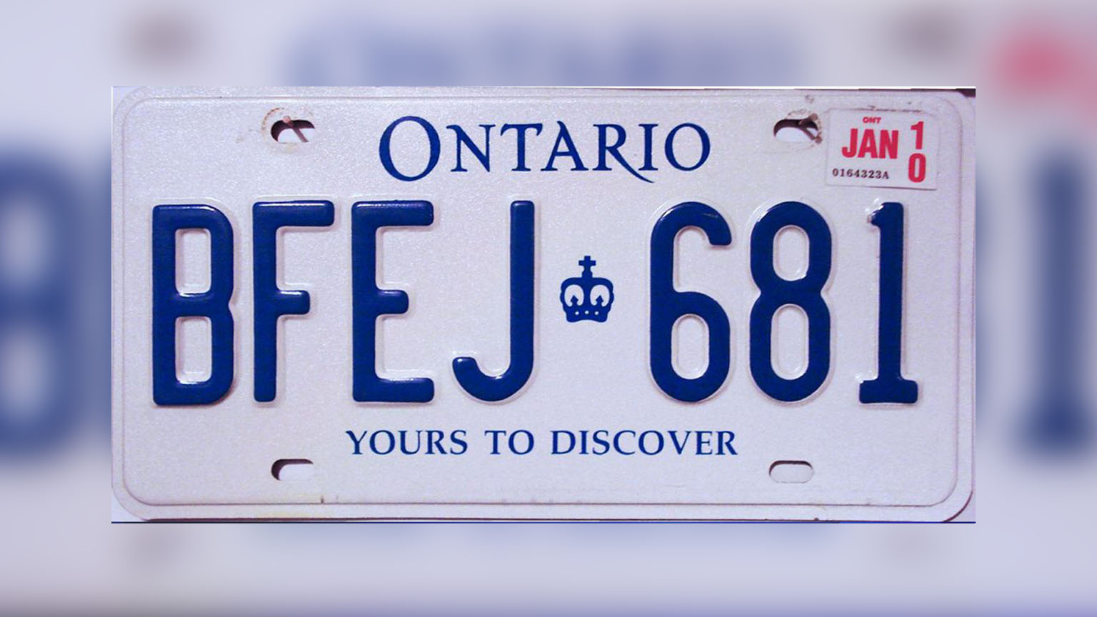
12. Ontario
Just as bad as Quebec but the blue is slightly less bad
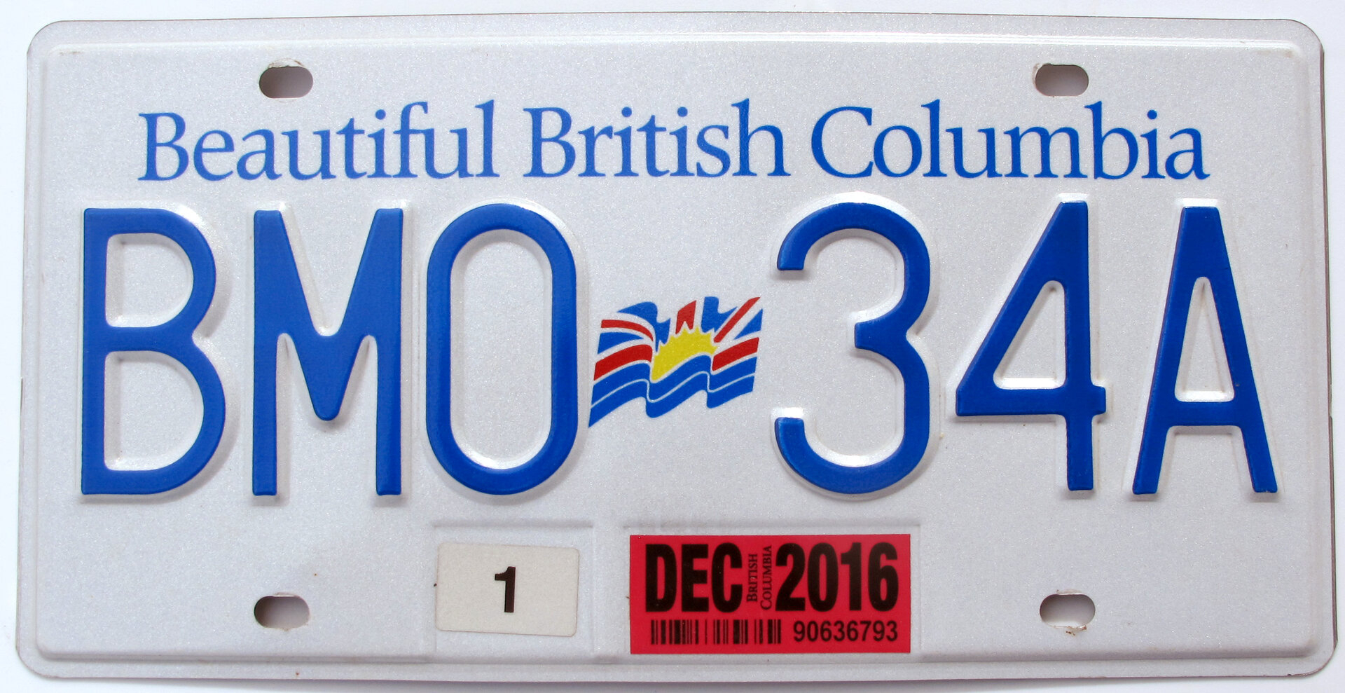
11. British Columbia
Still not good but the prettiest of the three blues
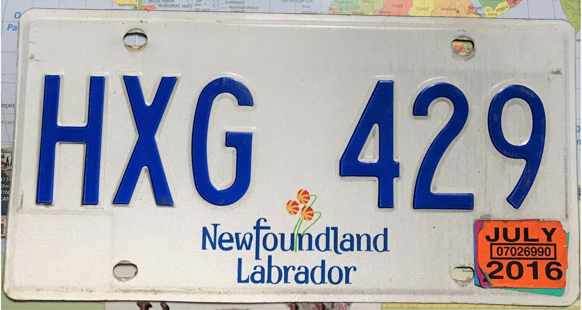
10. Newfoundland and Labrador
Also not good but the font is kinda nice and I like the flower
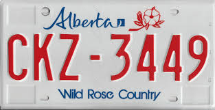
9. Alberta
It being a different colour is the only thing it has going for it
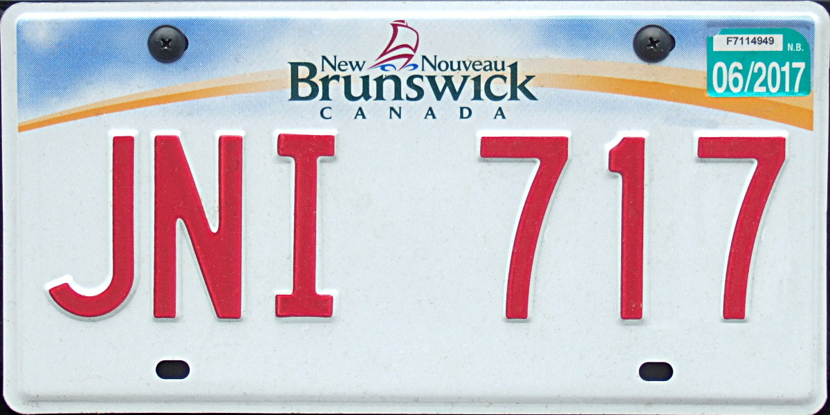
8. New Brunswick
The design is awful and the red text is the only thing saving it
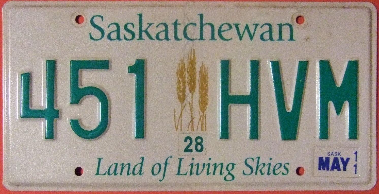
7. Saskatchewan
I really really like this green colour but this province is literally just wheat feilds as far as the eye can see… at least it’s accurate
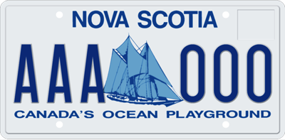
6. Nova Scotia
The boat is pretty but its bringing back that same bland blue font from before
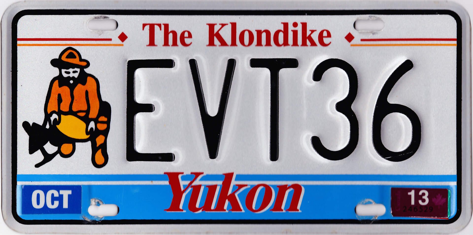
5. Yukon
I respect what they were going for. The person is a little too animated for my liking but details
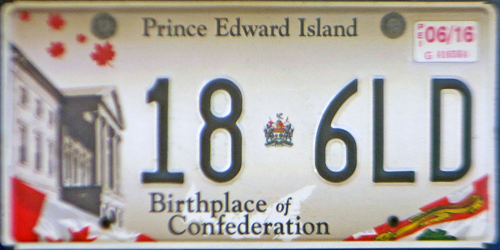
4. Prince Edward Island
It’s nice but the reality is that it’s just grey/beige buildings
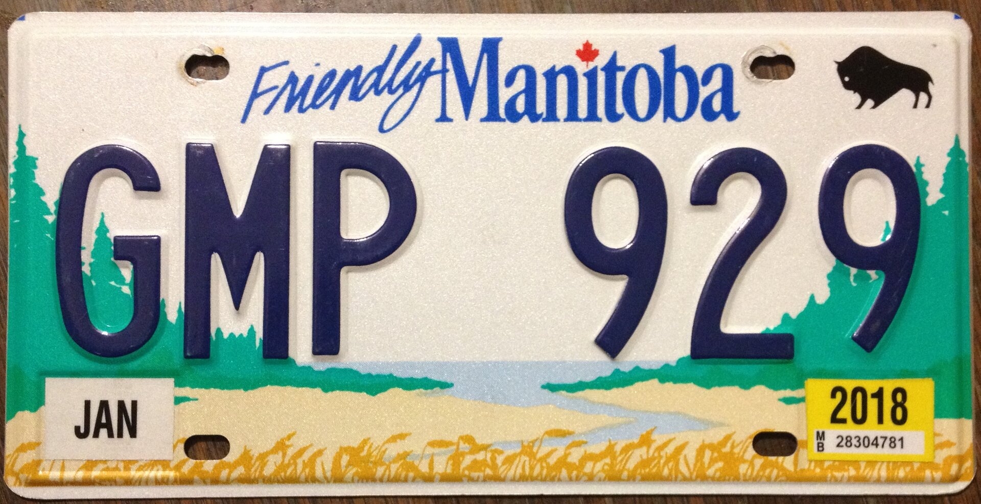
3. Manitoba
I have absolutely no complaints about this one, I love it. The little bison in the corner is a great addition
2. Nunavut
This is gorgeous, I have absolutely no complaints

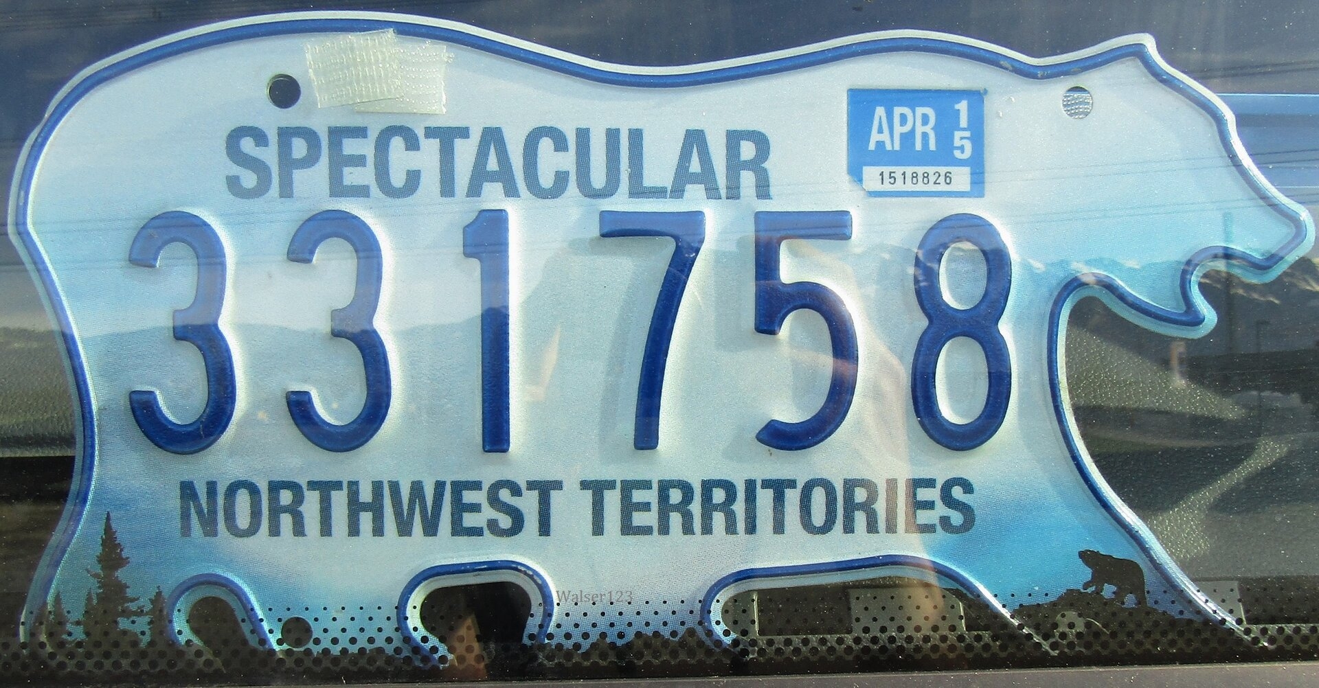
1. Northwest Territories
ITS A POLAR BEAR HOW FREAKING COOL IS THAT?!
The font is the same for everything and the colour is so bland.
12. Ontario
Just as bad as Quebec but the blue is slightly less bad
11. British Columbia
Still not good but the prettiest of the three blues
10. Newfoundland and Labrador
Also not good but the font is kinda nice and I like the flower
9. Alberta
It being a different colour is the only thing it has going for it
8. New Brunswick
The design is awful and the red text is the only thing saving it
7. Saskatchewan
I really really like this green colour but this province is literally just wheat feilds as far as the eye can see… at least it’s accurate
6. Nova Scotia
The boat is pretty but its bringing back that same bland blue font from before
5. Yukon
I respect what they were going for. The person is a little too animated for my liking but details
4. Prince Edward Island
It’s nice but the reality is that it’s just grey/beige buildings
3. Manitoba
I have absolutely no complaints about this one, I love it. The little bison in the corner is a great addition
2. Nunavut
This is gorgeous, I have absolutely no complaints
1. Northwest Territories
ITS A POLAR BEAR HOW FREAKING COOL IS THAT?!
Last edited:


![Super M [Ahsoka]](https://kpopsource.com/data/medal/1218_1600222072m.jpg)
![Rose Competition [Vikki]](https://kpopsource.com/data/medal/581_1610996728m.jpg)
![SHINee [Ahsoka]](https://kpopsource.com/data/medal/2238_1710820634m.jpg)
![STAR WARS EVENT [VIKKI]](https://kpopsource.com/data/medal/1166_1610996719m.jpg)


