- Joined
- 28 September 2021
- Messages
- 5,549
- Reactions Received
- 53,023
- Cards
- View Profile
- KS Coins
- 5,908
- Ship
- Wreck


As our event Yule Ball concluded around a week ago, I wanted to review some of the attire from the film's depiction of the character's fits using my love of fashion.
For this review, I'll be focusing on some of the female characters.
Starting off with Ginny Weasley:


Green and light pink is a cute combination, but it does not work in this case. Too much is going on in the gown, making Ginny look like a child. The peter pan neckline, ombre tulle, and hot pink sash clash. I liked the star embroidery on the torso of the gown though. It pays a subtle homage to Ginny's wizard roots while adding a tad bit of flair to the garment.
Overall, the dresses' general concept isn't bad but the execution wasn't pulled off well.
I feel like she would look better with the 50s/ 60s vintage silhouette-themed dress. Possibly something like this:
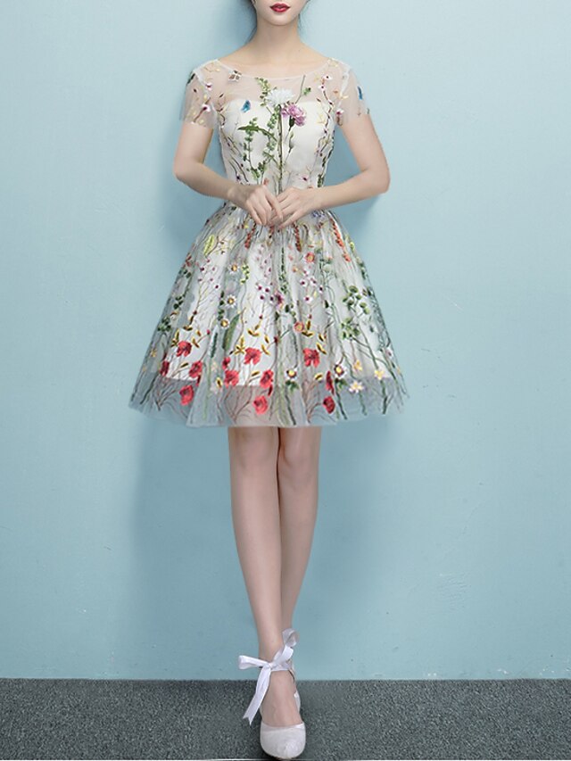
But with the flowers replaced with a star pattern to keep a subtle homage to her roots.
Also, the dress's outer tulle + slip could be the mint green used in the original.
Now, onto Fleur Delacour:

The dress's dusty grey color compliments her ice-blue colored eyes. The vertical cinching on the torso defines Fleur's figure while allowing the bottom half of the gown to glide off it like snow. Her metallic hairpiece and the gown's leaf embroidery blend in with her natural features' color scheme, making her look otherworldly and confidently stylish.
Now onto Hermione Granger:
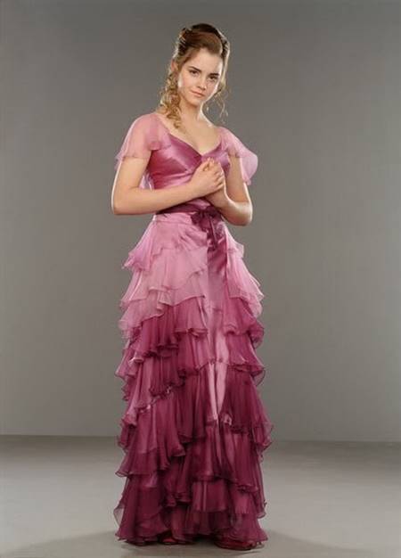
While the shades of pink compliment Hermione's delicate features, the dress looks unfinished and lumpy. I feel like adding more tulle to it to puff it up would help give the garment more shape while also complimenting the overall design of the dresses' torso.
Now onto Cho Chang:

Structured yet not too tight, the light grey silk dress embraces Cho's figure.
The flower pattern on the silk and the accented flower embroidery give the already stunning gown a vintage-esque feel that's classic and a tad bit reminiscent of 60s glamour.
Also, the dress's structure itself is not overly used, making the gown seem unique and one of a kind for anyone that wears it.
Finally, onto Parvati & Padma Patel:

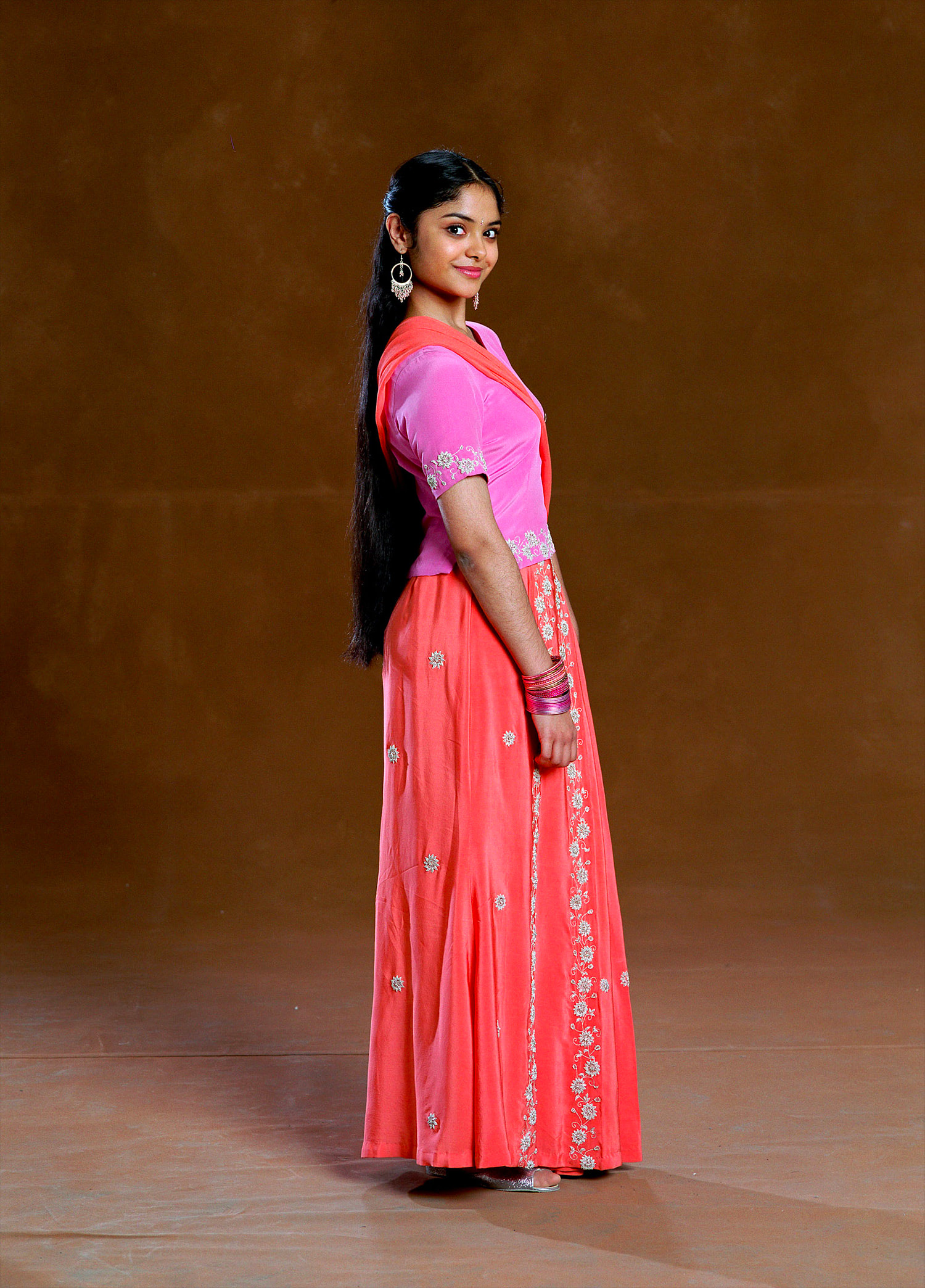
The film missed the ball on this one by a lot.
They were supposed to come to the Ball in majestic saris but the ones in the film lack structure.
On top of that, the embroidery is pretty plain for party wear. The blouse also lacks structure.
Overall, the fit seems hastily put together when compared to some of the other fits.
I feel like the twins should have been placed in something like this:

It's chic and embraces their South Asian heritage while also adding a modern twist to their fit.
--------------------
What do yall think?
OMG this took so long to do 
@Gryffindor @Ravenclaw @Hufflepuff @lexus @Chilly @Kamistar @xtra
@Wingfrost i finally made my review thread, i hope u like it >_<
imma go pass out / workout
For this review, I'll be focusing on some of the female characters.
Starting off with Ginny Weasley:
Green and light pink is a cute combination, but it does not work in this case. Too much is going on in the gown, making Ginny look like a child. The peter pan neckline, ombre tulle, and hot pink sash clash. I liked the star embroidery on the torso of the gown though. It pays a subtle homage to Ginny's wizard roots while adding a tad bit of flair to the garment.
Overall, the dresses' general concept isn't bad but the execution wasn't pulled off well.
I feel like she would look better with the 50s/ 60s vintage silhouette-themed dress. Possibly something like this:
But with the flowers replaced with a star pattern to keep a subtle homage to her roots.
Also, the dress's outer tulle + slip could be the mint green used in the original.
Now, onto Fleur Delacour:
The dress's dusty grey color compliments her ice-blue colored eyes. The vertical cinching on the torso defines Fleur's figure while allowing the bottom half of the gown to glide off it like snow. Her metallic hairpiece and the gown's leaf embroidery blend in with her natural features' color scheme, making her look otherworldly and confidently stylish.
Now onto Hermione Granger:
While the shades of pink compliment Hermione's delicate features, the dress looks unfinished and lumpy. I feel like adding more tulle to it to puff it up would help give the garment more shape while also complimenting the overall design of the dresses' torso.
Now onto Cho Chang:
Structured yet not too tight, the light grey silk dress embraces Cho's figure.
The flower pattern on the silk and the accented flower embroidery give the already stunning gown a vintage-esque feel that's classic and a tad bit reminiscent of 60s glamour.
Also, the dress's structure itself is not overly used, making the gown seem unique and one of a kind for anyone that wears it.
Finally, onto Parvati & Padma Patel:
The film missed the ball on this one by a lot.
They were supposed to come to the Ball in majestic saris but the ones in the film lack structure.
On top of that, the embroidery is pretty plain for party wear. The blouse also lacks structure.
Overall, the fit seems hastily put together when compared to some of the other fits.
I feel like the twins should have been placed in something like this:
It's chic and embraces their South Asian heritage while also adding a modern twist to their fit.
--------------------
What do yall think?
@Gryffindor @Ravenclaw @Hufflepuff @lexus @Chilly @Kamistar @xtra
@Wingfrost i finally made my review thread, i hope u like it >_<
imma go pass out / workout

![KS Arcade [badcrookshanks]](https://kpopsource.com/data/medal/2261_1766939972m.jpg)


![Huening Kai [badcrookshanks]](https://kpopsource.com/data/medal/2262_1713647581m.jpg)


![Lee Hi [Nina]](https://kpopsource.com/data/medal/2361_1724713914m.jpg)
![KS Arcade [Nina]](https://kpopsource.com/data/medal/2253_1715907491m.jpg)


![I.M [Nina]](https://kpopsource.com/data/medal/2455_1735231784m.jpg)


![Donation [Boyo]](https://kpopsource.com/data/medal/2390_1728246881m.jpg)

![Donation [Boyo]](https://kpopsource.com/data/medal/2391_1728247541m.jpg)
![V [Boyo]](https://kpopsource.com/data/medal/2389_1728246822m.jpg)

![Win Metawin [Boyo]](https://kpopsource.com/data/medal/2308_1719261902m.jpg)
![Pavel Phoom [Hakunama_Tata]](https://kpopsource.com/data/medal/2215_1705784236m.jpg)


![Super M [Ahsoka]](https://kpopsource.com/data/medal/1218_1600222072m.jpg)
![Rose Competition [Vikki]](https://kpopsource.com/data/medal/581_1610996728m.jpg)
![SHINee [Ahsoka]](https://kpopsource.com/data/medal/2238_1710820634m.jpg)
![STAR WARS EVENT [VIKKI]](https://kpopsource.com/data/medal/1166_1610996719m.jpg)