
- Joined
- 18 March 2024
- Messages
- 8,207
- Reactions Received
- 9,882
- Location
- ♰ eden
- Website
- f5veofficial.com
- Cards
- View Profile
- KS Coins
- 33,101
- Fandom
- (╥﹏╥) orbit
- Gender
- Female
- Pronouns
- she ౨ৎ her
 magali


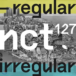
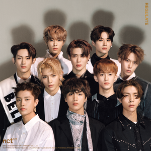





definitely! they look boringThose pure text based ones Twice had, I'm glad they changed it again for the newest one
i just realized the first "e" on the album cover is a nineyeah!! super unfittig for Twice!
atleast that's cute!
![Have You Met [ani07]](https://kpopsource.com/data/medal/1971_1694870476m.jpg)
![KS Arcade [ani07]](https://kpopsource.com/data/medal/2255_1712538480m.jpg)
![Have You Met [ani07]](https://kpopsource.com/data/medal/1956_1686740271m.jpg)
![Journey into the Enchanted Forest [ani07]](https://kpopsource.com/data/medal/2341_1723525092m.jpg)
![Have You Met [ani07]](https://kpopsource.com/data/medal/2506_1744231478m.jpg)
![Have You Met? [ani07]](https://kpopsource.com/data/medal/2626_1770415830m.jpg)
![BossNoeul [ani07]](https://kpopsource.com/data/medal/2534_1748191912m.jpg)
![Have You Met? [ani07]](https://kpopsource.com/data/medal/2537_1748885676m.jpg)


![WHOS [RandAlThor]](https://kpopsource.com/data/medal/1148_1589468878m.jpg)


i feel like the snake doesn't look too much like a snake at first glance, also i never noticed the textHWASA - Maria.
I like the song, I like the MV. But the album cover is just bad.
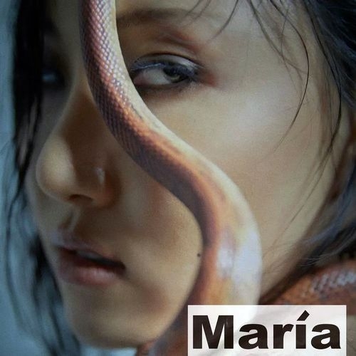
It seems there are two versions of the album. But both have the text.i feel like the snake doesn't look too much like a snake at first glance, also i never noticed the text