give me a character... (1 Viewer)

Joined
28 May 2021
Messages
1,060
Reactions Received
1,081
Cards
View Profile
KS Coins
0
Fandom
Multi
Gender
Non-Binary
Pronouns
they/them
and ill critique their design
 
Joined
28 May 2021
Messages
1,060
Reactions Received
1,081
Cards
View Profile
KS Coins
0
Fandom
Multi
Gender
Non-Binary
Pronouns
they/them
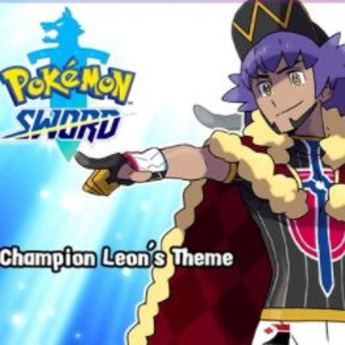
ok so... i know nothing about pokemon.... i might actually hate this design.
right off the bat, it looks inspired by european royalty, but then he's wearing sport clothing underneath. and it's not even combined well? i think the idea could work but they didn't even try to make a sport outfit that looks like royalty. i can say i like the idea of the sword + shield on his chest sorta being a crest or potentially a cross without being a cross either? (cause it'd break nintendo's rules)
the colors work together but the purple hair looks SO out of place. the yellow in his hat, waistband, and gloves also sorta look out of place as well? because its at a darker shade than the rest of the colors in his design; the others are brighter or more saturated.

overall; he looks like an athlete with a cape thrown on him. maybe thats the point, i don't know pokemon :haylul:
 
Joined
28 May 2021
Messages
1,060
Reactions Received
1,081
Cards
View Profile
KS Coins
0
Fandom
Multi
Gender
Non-Binary
Pronouns
they/them
i have no idea who this character is or what their name or purpose is but;
its so basic. that doesn't necessarily have to be a bad thing but... this one looks kind of uninspired to me. anyone can create a superhero design of the superheroes from the 1940s-1960s, mix up the colors, and add some hair.
i can at least say, the colors are okay. they're not FANTASTIC or anything, but i can't complain about them much. the single complaint about the colors i have is: the blue B symbol. it's the same shade of blue as the pants, which does NOT work well with the black in the logo. the blue is a navy blue which is a very dark and less-saturated color; its sometimes hard to tell from black.

more or less, unless this character is meant to be a joke or parody of the 40s-60s, its so uninspired.
 

Tickita

𝒜𝓃 𝒾𝓃𝓋𝒾𝓃𝒸𝒾𝒷𝓁𝑒 𝓈𝓊𝓂𝓂𝑒𝓇.
.
.
.
Joined
30 January 2020
Messages
26,480
Reactions Received
39,142
Location
We're no strangers to love.
Cards
View Profile
KS Coins
41,434
Gender
Female
Pronouns
she, her, mrrp
i have no idea who this character is or what their name or purpose is but;
its so basic. that doesn't necessarily have to be a bad thing but... this one looks kind of uninspired to me. anyone can create a superhero design of the superheroes from the 1940s-1960s, mix up the colors, and add some hair.
i can at least say, the colors are okay. they're not FANTASTIC or anything, but i can't complain about them much. the single complaint about the colors i have is: the blue B symbol. it's the same shade of blue as the pants, which does NOT work well with the black in the logo. the blue is a navy blue which is a very dark and less-saturated color; its sometimes hard to tell from black.

more or less, unless this character is meant to be a joke or parody of the 40s-60s, its so uninspired.
Now I wanna post another one; what a great review :lisalaugh:
 
Joined
19 October 2020
Messages
19,165
Reactions Received
28,437
Cards
View Profile
KS Coins
1,455
Fandom
multi BG
Gender
Female
Xiao Xingchen
 

Create an account or login to comment

You must be a member in order to leave a comment

Create account

Create an account on our community. It's easy!

Log in

Already have an account? Log in here.

Viewing thread