- Joined
- 28 May 2021
- Messages
- 1,060
- Reactions Received
- 1,081
- Cards
- View Profile
- KS Coins
- 0
- Fandom
- Multi
- Gender
- Non-Binary
- Pronouns
- they/them


![Donation [TicTokTickita]](https://kpopsource.com/data/medal/1149_1590017551m.jpg)


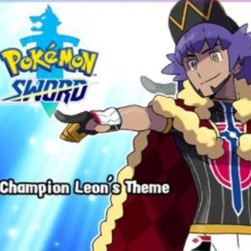
ok so... i know nothing about pokemon.... i might actually hate this design.

i have no idea who this character is or what their name or purpose is but;
Now I wanna post another one; what a great reviewi have no idea who this character is or what their name or purpose is but;
its so basic. that doesn't necessarily have to be a bad thing but... this one looks kind of uninspired to me. anyone can create a superhero design of the superheroes from the 1940s-1960s, mix up the colors, and add some hair.
i can at least say, the colors are okay. they're not FANTASTIC or anything, but i can't complain about them much. the single complaint about the colors i have is: the blue B symbol. it's the same shade of blue as the pants, which does NOT work well with the black in the logo. the blue is a navy blue which is a very dark and less-saturated color; its sometimes hard to tell from black.
more or less, unless this character is meant to be a joke or parody of the 40s-60s, its so uninspired.